The designers were told: You are starting a line on a very busy street with your store neighbours who are very successful, and have been selling now for eight years. How do you compete?Create two designs to knock your compition down. This is about commerical appeal. Make your model in two different statuesque poses (like mannequin's). This is due on...WENSDAY! Disclaimer: Don't create any lackluster (Tim Gunn) designs please, we have had enough of those already. Just because this is about commercial appeal, doesn't mean that you have to be BORING!!!!!!!!! So be innovative.
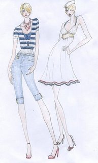
realityundersiege designed two naticul inspired outfits, which by far were very sellable and flattering. Then won! The first outfit was a nautical dress which was beautifuly exicuted. I was pleasingly disarmed by her beautiful navy and white jacket and matching bleatched jeans. Her look possessed an elegance, grace, and functionality, all what I was expecting through this challenge. reality's future after Project Designer looks bright!
It looked like midgetpanda saluted the mindframe of a very stylish teenage woman in her very effeminate design. I liked that she named her designs: Mannequin Cool, and Manneqin Sweet...it gave it the "midgetpanda" flair. When I saw the design I automaticly thought: candy. Which was reminsent of gumballs that I used to buy at the auto supply store. I have to say, this was a contender for the win.
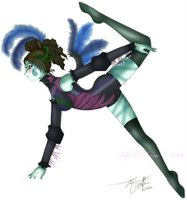
ZebrASkin44 kept saying that she hoped that she wasn't boring...and by golly she wasn't! Her inspiration came from an Indian inspired S&M concept which translated beautifly. The only think that I was concerned with was: could you see people walking down the street in this? I could definatly see people wearing anything except the consticted pant. Maybe if it wasn't so strained and more slack. I just found out that the fishnets were lacing...so that makes a big differance. Anywho, the design was fine.
Juliet196 created a design that reflected her common theme among previous designs other than Project Designer...shirred pannels; in the skirt as well as the empired detailed top which I must say was quite fabulous. I was expecting this from Juliet...because she loves to do ready-to-wear, so im not suprised that she did so well. Her look resonated with her mantra: quality, taste, and style. Superb showing, Juliet!
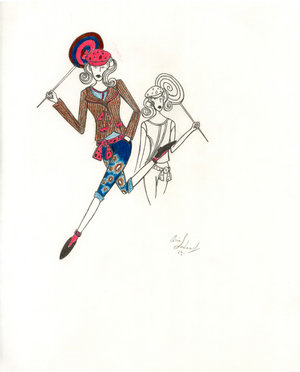
Alia-Chan17 appaled me with this design. It wasn't but it was what I was expecting from her. It was wacky, artsy, punky, as I ahve stated before...but would it sell? The boat neck denim jacket was cute...but overall I was displeased excpecially with the left design. There was something dissonant about the collective look of Alia's two pieces, as though they had been selected from the closet of two entirely different people. It troubled me. It didn't quite work, but she took risks. Therefore, I was pleased -- and relieved -- that she survived the judging, because I had only the highest expectations of him based on her previous designs.
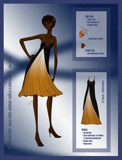
ladylucrezia created another beautiful design. The color, fabrication, and sewn insert choices were unique and brought an oriental style to the outfit. She also brought military infuences, which when was applied to the dress became a rich, voluminous confection. Her evening gown reminded me of one of her previous designs...the Save the Animals design...that too was fabulously exicuted. Bravo!
Jennlee05 created palaple designs...but why would you do one spring and winter from the same collection? I was baffeled by this chocie. However, if you disreguard this simple error, the designs were actually pretty. Her winter outfit was origanlly blue but then it turned out a light teal color. Thank goodness the fabric was the wrong color....all in all it was passable. But I said no more lackluster (Tim Gunn) designs...
selay created a fabulous concoction of two outfits. The designs were unique and had the "selay" design style, and the outfits were borught to life by the manniquins. The cohiseive colors and bright background would make women FLOCK over this design...and her construction was gorgeous. Great work, selay! This was definatly a contender for the win.
Eldheler's first design failed, not because she failed to color...but instead because she failed to listen. The design on the right would not sell very well...It was unique no doubt, but could it sell to thousands and thousands of people? The skirt was voluminus, to voluminous...would YOU, the designer, even wear that don the stree. However it was saed by the FABULOUS design on the right. It was flawless. The grouping of the fabric was undeniable beautiful, and the sillouette...gorgeous. The only thing that worried me was the design on the right. Other than that...it was fabulous.
OUT: ApparelAngel played it a little...alot safe rather. Every store does tee-shirts and skirts...but what makes it different? A chligraphy print? It COULD last for many styles, but as Jean Cocteau once said: Art produces ugly things which become beautiful over time, Fashion on the other hand, produces beautiful things which always become ugly with time. The outfit was better suited for a flea market than on a street with top contenders tents. Angel, it's boring.


